Answering “what-ifs” right away, matters.
When things go sideways – it matters more.
Alignment matters.
Readiness in tackling surprises is everything.
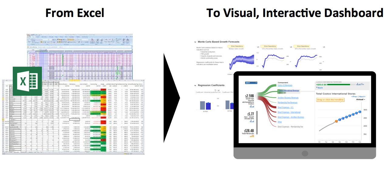
Go right from your Excel models/data into a business dialog on Trefis Interactive Dashboard.
Join the winners!
One tool. Incredibly simple.
Designed by MIT engineers.
Used by a million users.
How it works
Step 1
Load your Excel data, transform into an interactive dashboard in minutes.
Step 2
Test risk-reward, modify assumptions, Capture team’s expectations. See the consensus, but preserve the variety of opinions.
Step 3
Readily draw on the richness of different ideas to be better planned in the face of shocks.
Why it works
What happens to a CFO’s dividend or capex plan when there is a new competitor in China?
What about a manager’s launch forecast when faced with a regulatory challenge?
Would a consultant’s market entry recommendation still hold if there is an operational surprise – an unexpected supply chain issue, a manufacturing glitch, or disruption in distribution?
What do the best leaders, managers do?
We’ve learnt that it is in these situations that the team awareness matters. Alignment matters. Differences in opinion matter. A dashboard that allows teams to quickly see the different possibilities, test risk-reward, and reach alignment quickly – matters!
We’ve learnt from the practices of the best and simply made it possible for everyone to plan consistently. Real-time. Like the best.
There is no magic. Just good people – and smart tools!
Solutions Summary
Answer unlimited what-ifs – real-time. In a meeting.
Correct, you just can’t do this on Tableau or Qlik.
- Modify forecasts, see impact on financial metrics in real-time
- Compare different opinions visually
- Eliminate “number crunching” latency
- Ask more what-ifs without having to schedule follow up meetings
How to input data? Simple. Right from your Excel. No IT.
Upload Excel model directly from desktop. Convert into a dashboard in minutes
Trefis is Excel model plug-and-play
- No Excel templates
- No IT deployments
- No integration consultants
Trefis transforms your Excel models in a matter of minutes.
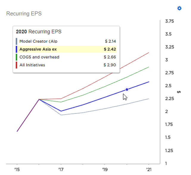
Compare scenarios – region’s vs global team's expectations; R&D expert’s vs Sales and Ops team’s scenarios.
- Don’t just meet, or guess the impact, instead see impact of opinions on financials and metrics that matter.
- All opinions and charts in one place. Lose nothing.
- Preserve the alternatives. Pick up exactly where you left.
- Revisit regularly or as needed.
Toggle initiatives on or off, compare strategic options, assess risk-reward
- Present scenarios as strategic options for executive consideration, accelerate buy-in and richer dialog.
- Modify as many forecasts and create as many scenarios as you wish.
- Provide team members with secure access to your interactive models and scenarios.
Change perspectives on the fly
- Control the default view for your forecasts.
- Allow collaborators to change views on the fly.
Add benchmarks
- Put forecast discussions in context by pulling in relevant data from other models or databases.
- Conveniently access data via search.
- Plot data on forecast inputs or outputs.
Skip PowerPoint – entirely. Go straight from Excel to a business dialog.
Editorial curation built into Trefis so you can control the narrative.
- Decide which forecasts and data are accessible via Trefis as easily as drag and drop.
- Hide or exclude forecasts or results that aren’t core.
- Add headings, commentary or takeaways to provide context.
- Skip the charting in Excel, pasting into PowerPoint for discussion process entirely in some cases.
Sounded crazy when we first heard clients say it.
Now people have become used to it.
Align with your workflow
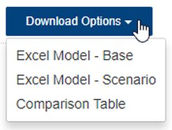
- Download forecast changes and scenarios made via Trefis back into Excel.
- Re-upload in minutes revisions made in Excel to Trefis and see your changes reflected.
Whether internal work-sessions, or executive meetings – we are passionate about how clients are using Trefis in new and creative ways for their business dialog to:
- Answer what-ifs real-time.
- Compare differences in opinion and assumptions, instantly see impact on finances.
- Record the differences, without losing the consensus.
Ultimately – Break The Iterative Cycle!
- Reduce repetition & friction.
- Meet less. Produce more.
- Align better.